
When we see or think of St. Patrick’s Day, we think green. We wear green. We eat green things. Here’s a bit of cultural trivia you may not have been privy to: Irish Catholics used the green in the flag as theirs, while the Orange was the color chosen by the Protestants. Just a little history factoid for you.
For those of us who ponder and research the colors in our logos and branding and imaging, it’s interesting to see that this relationship of visual related to a cause or entity or organization is definitely not knew.
The flags that flew at the Olympics during the medal ceremonies are a touching and powerful example of that fact. The now famous pink ribbons for Breast Cancer Awareness or the very familiar red and white circle of Coke.
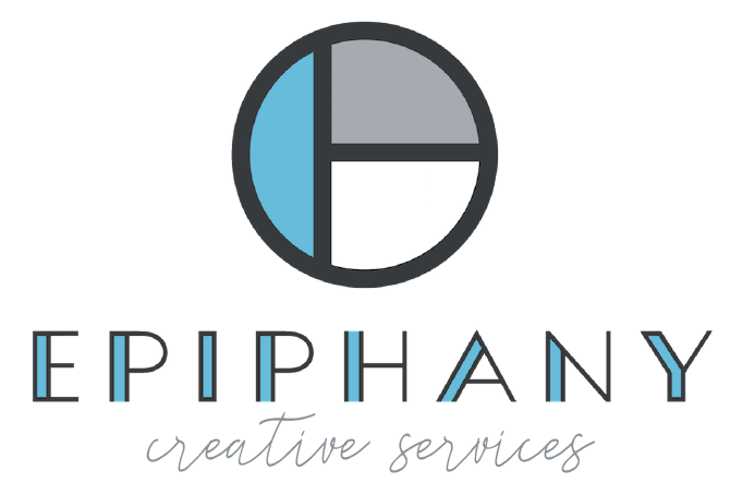
Colors mean a lot. We have all heard of the symbolic meanings attached to them or the psychological affect they have on a person. And they usually, or should, tell a story. For example, in the new Epiphany logo, you’ll see some blue. Like water I guess. Perhaps that’s my affinity to the ocean coming out in me. The fact that I grew up in San Diego, or that I can be found vacationing near some form of water (yes, that includes snow) whenever possible. It’s my go-to of choice. I love the sound of water. The cleansing affect it has. Thus, the blue elements you’ll find in our mark today.

If you’ve been thinking about refreshing your logo, or image, or hadn’t even had the chance to begin, but know that you should, we’d love to be a part of your journey. At Epiphany, it’s all about helping you find what you need that will bring you to that “aha” moment you’ve been needing or looking for.
In the meantime, the team at Epiphany would like to wish you and yours a very Happy St. Patrick’s Day.